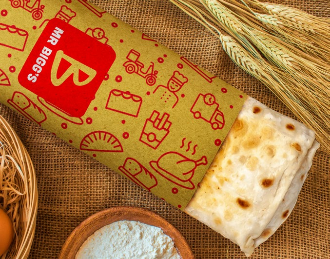
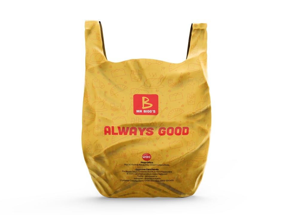
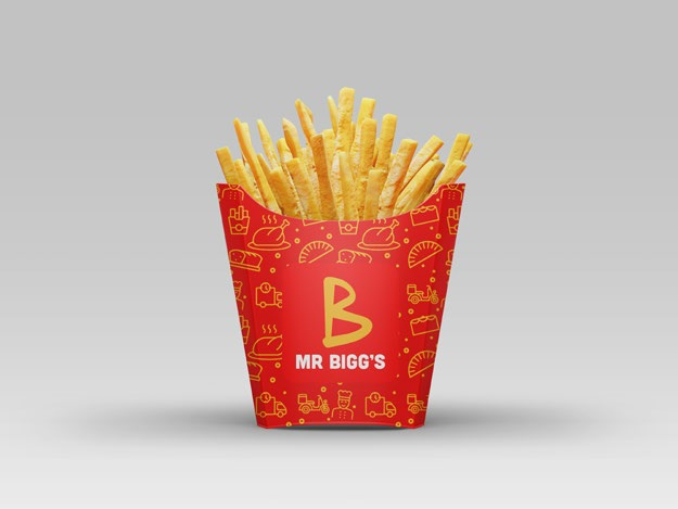
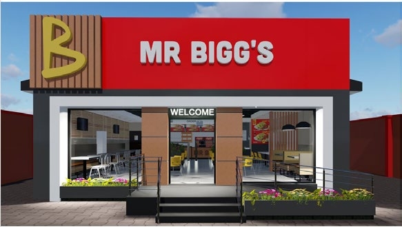
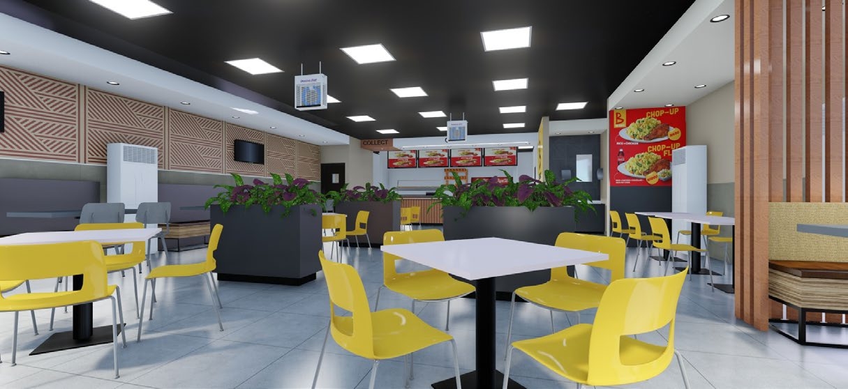
Where memories meet meals.
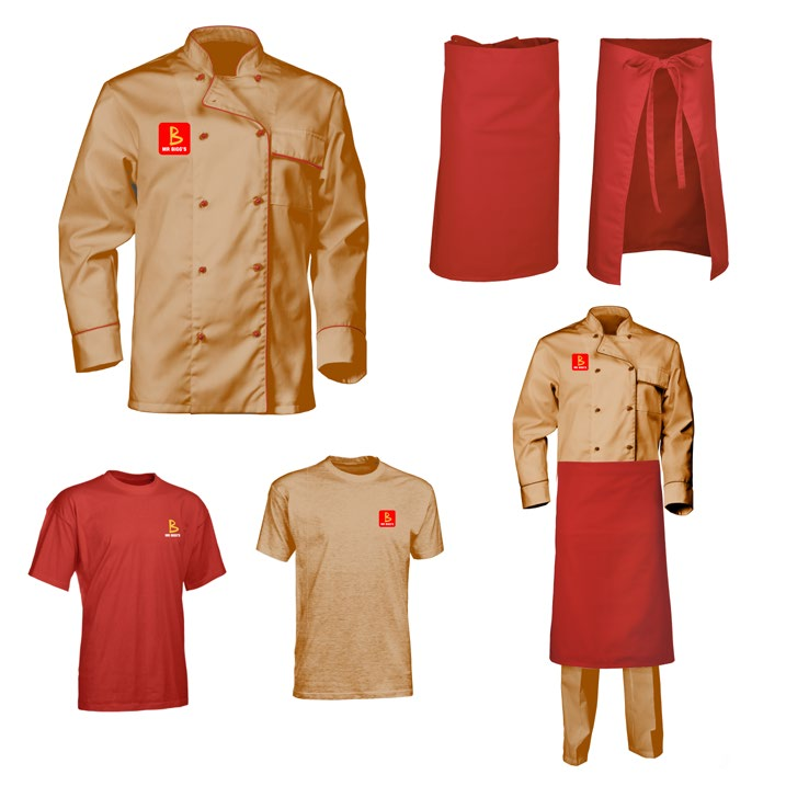
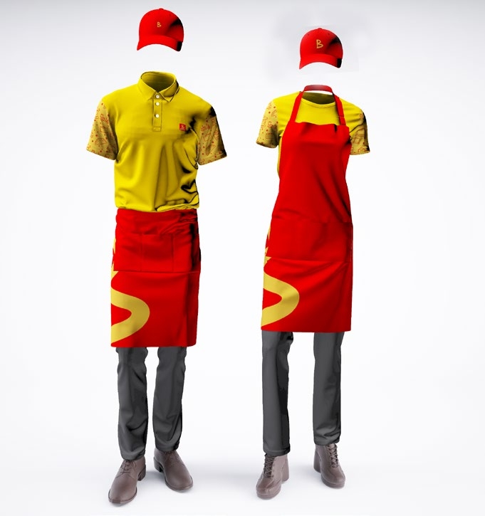
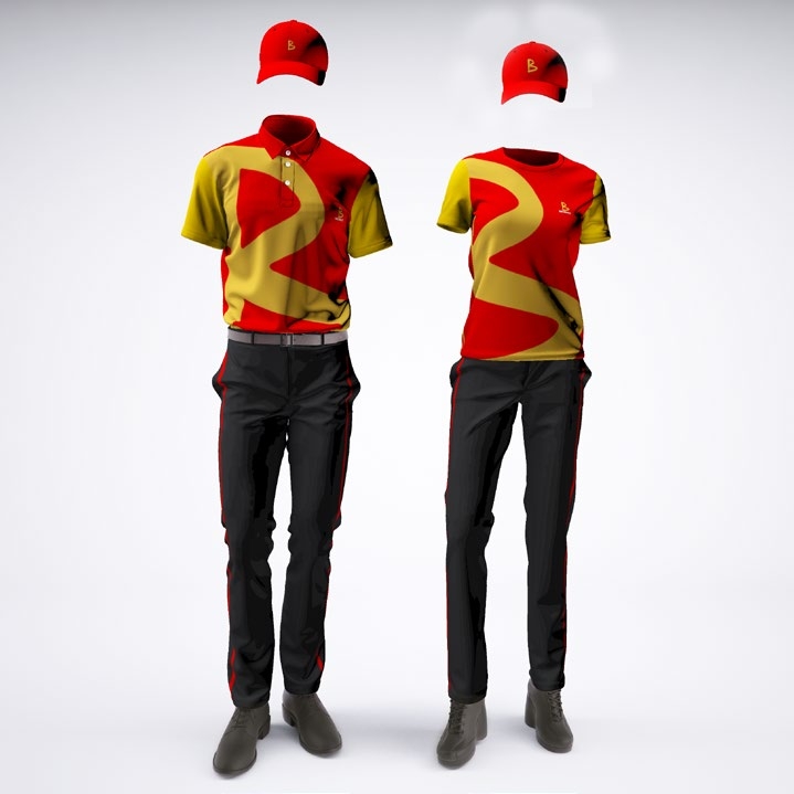
Build a bold, cheerful brand identity and visual system that repositions Mr Bigg’s as Nigeria’s iconic quick service restaurant, blending its proud heritage with modern relevance to inspire trust, nostalgia, and everyday enjoyment for families and communities.

Mr Bigg’s is one of Nigeria’s first and most iconic quick service restaurant brands, founded in 1986. Over the years, the brand has grown to over 170 outlets nationwide, delivering delicious meals with consistency, warmth, and quality.
The brand continues to evolve with changing consumer lifestyles, focusing on digital innovation, service excellence, and customer satisfaction while maintaining its proud Nigerian heritage.
Mr Bigg’s communicates in a professional, friendly, and wholesome manner. The brand voice is down-to-earth, honest, cheerful, and inclusive, reflecting its family-oriented nature.
Every communication prioritizes sincerity, clarity, and warmth, ensuring customers always feel welcomed and valued.
The Mr Bigg’s design tone is clean, bold, and honest. It reflects a proudly Nigerian identity while competing confidently with global brands.
All visual materials work together to create a consistent and recognizable presence in a highly competitive environment.
From its early beginnings in 1986, Mr Bigg’s has undergone several transformations to meet modern consumer expectations.
The brand refreshed its logo, service model, and digital presence to remain relevant while maintaining its human-centered approach.
The Mr Bigg’s logo features the iconic “Bigg B” symbol combined with the Cubano wordmark. It represents joy, quality, and long-standing brand recognition.
The logo must always be used in accordance with spacing, size, and colour guidelines to ensure consistency.
The Mr Bigg’s logo features the iconic “Bigg B” symbol combined with the Cubano wordmark. It represents joy, quality, and long-standing brand recognition.
The logo must always be used in accordance with spacing, size, and colour guidelines to ensure consistency.


Cubano is used for headings while Neue Haas Display is used for body text. Arial serves as the fallback font for internal documents.
Typography reinforces clarity, readability, and brand personality.
Custom pictograms and patterns create visual interest and enhance brand recognition across touchpoints.


The final logo reflects Mr Bigg’s heritage, confidence, and modern outlook. It is optimized for print, digital, and environmental applications.

Mr Bigg’s identity extends across packaging, uniforms, signage, vehicles, menus, and digital platforms.
Each application reinforces brand consistency and customer trust.


